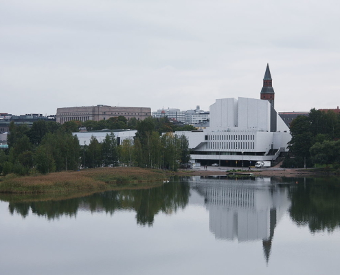
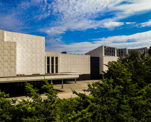
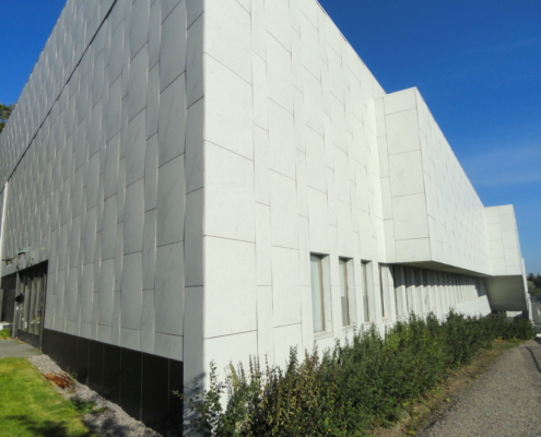
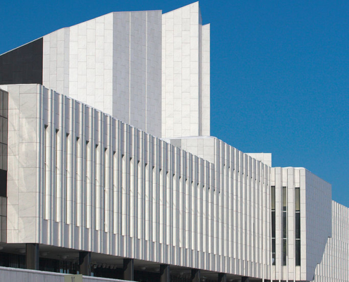
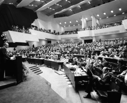
The main feature of the Finlandia Hall building is a tower like section with a sloping roof. Alvar Aalto’s idea behind the design was that a high empty space would provide better acoustics. A lattice ceiling hides the space to the audience but it allows the creation of the same deep post-echo as tall church towers. Aalto used marble in both indoor and outdoor surfaces as a contrast to black granite. For Aalto, marble was a tie to the Mediterranean culture, which he wanted to bring to Finland.
Finlandia Hall features an optical illusion: the National Museum building on the other side of the street seems to rise from the edge of the Finlandia Hall tower. The effect is created by a black trapezium on the white marble surface of the Finlandia Hall tower. The trapezium has been measured to fit the rising tower of the National Museum when the Finlandia Hall is viewed from the eastern shore of the Töölönlahti Bay. Aalto liked to create optical illusions. Another example of this can be found on the pedestrian path behind the library building of the Helsinki University of Technology (current Aalto University) in Espoo.
The interior design of the building is a tribute to detail. The design of each lamp, piece of furniture, panel, flooring material and decorative board reflects the mature approach resulting from Aalto’s long career as an architect. All the materials speak the language of nature, simply without technically artificial tones. This is because Aalto’s basic view was that architecture should create a frame for human beings. In the Finlandia Hall, the focus is not on extraordinary forms or ostentatious interior. It is on the audience and on the performers. According to Aalto, the audience at the Finlandia Hall need not dress up like people used to in the opera foyers and gilded concert halls of the old days. What people wear should be as genuine and natural as the environment in the building.
Information provided in part by: Wikipedia

