Art of Americas Wing at the Museum of Fine Arts
Foster + Partners | Website | 2010 | Visitor Information
"
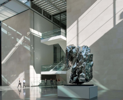
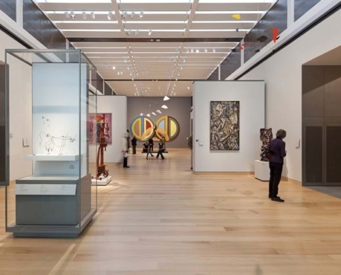
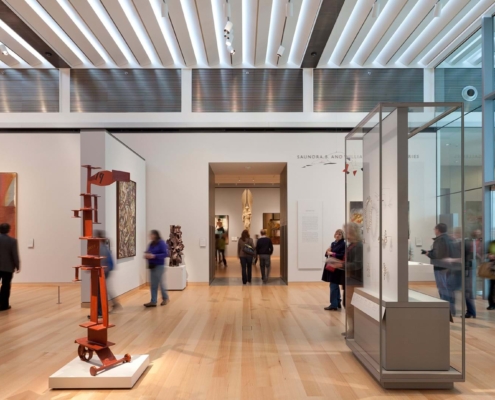
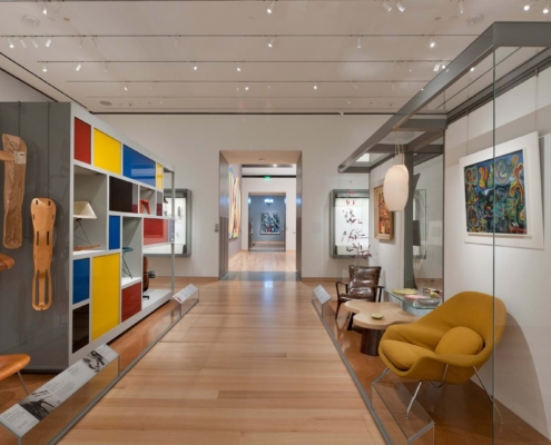
"The Museum of Fine Arts, Boston (MFA) recently unveiled their new Art of Americas Wing designed by Foster + Partners in collaboration with CBT/Childs Bertman Tseckares of Boston. The carefully designed wing, contributed to the restored and augmented visitors experience, that reinstates the original formal axis of the Musuem and its relationship to the linear Back Bay Fens park designed by Frederick Law Olmsted in 1877. The new wing hosts 53 new galleries including the Art of the Americas collections, and consolidates the Museum’s five great collections into a more cohesive and understandable whole. Norman Foster commented that, “The MFA is more than a great cultural institution – it is the catalyst for the rejuvenation of an entire neighbourhood in Boston. Over time the Museum had lost its connection to the Back Bay Fens and the beautiful landscape of Frederick Law Olmsted’s ‘Emerald Necklace’. In restoring Lowell’s original plan and in opening up and reasserting the grand Fenway entrance, we have rediscovered this link. At the same time, we have drawn the landscape deep into the heart of the building and along Huntington Avenue. The result is a more legible museum that will create new connections between the park, the Museum and the local community.” Founded in 1870, the Museum of Fine Arts is based on a Beaux-Arts plan devised by the architect Guy Lowell. Restoring the logic of the original scheme, the building’s central axis has been reasserted with the reintroduction of the principal entrance to the south, on Huntington Avenue on the Avenue of the Arts, and the reopening of that to the north, the State Street Corporation Fenway Entrance. At the heart of this axis is a new information centre, where visitors begin their tour. Alongside is a freestanding glazed structure, which has been inserted between the building’s two main pavilions to create the Art of the Americas Wing. Arranged over four floors, the new wing significantly increases the Museum’s exhibition space, enabling some 5,000 works from the collection to be displayed. The project is the first time Foster + Partners has comprehensively designed a complete gallery wing, including installations and fit-out – the plan for the 53 galleries was the result of close collaboration with the Museum’s curators and conservators. Where the central building of the wing meets the axis of the main building, it partly encloses an existing courtyard in glass. This creates spaces for visitors, a café, special events and access to other collections with a new gallery for special exhibitions beneath. Designed to be energy efficient, the courtyard is naturally lit and the galleries have state-of-the-art climate control. The gallery spaces are configured to allow art to be displayed with a more obvious sense of clarity and light. Surrounding the museum, new landscaping is designed to strengthen links with the Back Bay Fens, laid out by Olmsted, architect of New York’s Central Park. The landscape design follows Olmsted’s Romantic tradition of winding paths and informal planting to draw the greenery of the Fens into the building. In particular, the Fens landscape is drawn into the heart of the Museum, encapsulating the new Courtyard and American Wing. Spencer de Grey, Head of Design at Foster + Partners, commented: “This has been one of the most fascinating projects. We have sought to combine the constraints of history with a new intervention that will show off the Museum’s extraordinary collection of American art in a way that will excite, entrance and educate. We have designed a major new Wing, inside and out, with 53 new galleries to complement the Museum's other four collections which are clearly articulated along the original main axis. This re-addresses the balance of the Museum - at its heart the old courtyard is enclosed in glass to create new links and connections.”"
"
Information provided in part by: Arch Daily


