"
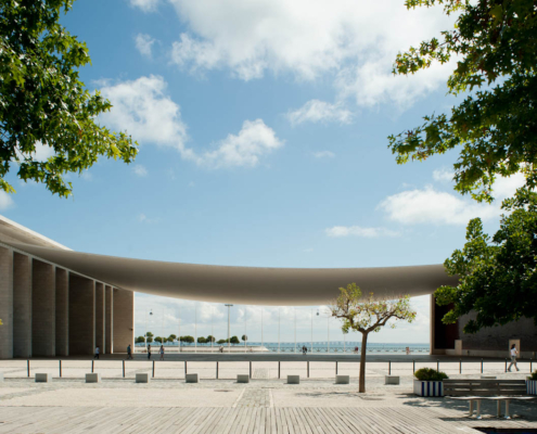
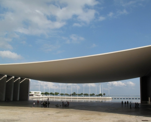
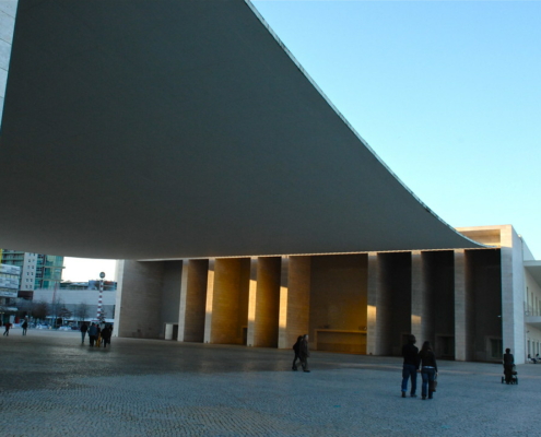
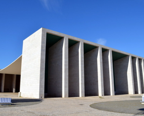
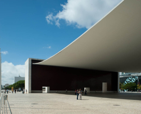
Built for the 1998 Lisbon World Exposition, the building was designed to be the thematic centerpiece of the festival and the host country’s national pavilion. The focal point of the project is a large, open public plaza shaded by a suspended overhead canopy. The architect, emphasizing the connection between the space and the view beyond, wanted to frame the vista of the river with an enclosed and column-free space. Two monumental piers support the roof, behind one of which sits a building designed to house the pavilion’s main exhibition spaces.The trademark canopy is a tremendous feat of technology, engineering, and modern design. It is formed by the catenary arc of steel cables draped between the porticoes which were subsequently infilled with pre-stressed concrete. Using the same technology as a suspension bridge, it is designed as a stressed-ribbon structure, wherein the loose cables are stiffened with concrete to eliminate sway and bounce. In addition to giving the canopy an elegant, clean texture, the painted concrete weighs the roof down to prevent strong drafts from moving or lifting it from below. The porticoes, while playing an important structural role, are articulate architectural elements in their own right. Each has nine massive columns, arranged in a beautifully rhythmic but provocatively asymmetrical manner. Deep cuts between the columns create dramatic contrasts of shadow and light, highlighting the clean lines of the columnar profiles. A façade treatment of colorful ceramic tiles in the deep recesses, glazed in the national colors of green and red, adds a playful touch to the otherwise austere and monumental structures. To the north of the public plaza, a rectangular building provides an elegant if more classically modern space for exhibitions. Focused around a central courtyard, it is derived from a single grid system with the exception of a lone diagonal wall angled toward the water on the northern side. The building is outwardly simple and clean, painted white with a rusticated ground level. Balconies and cantilevered roof slabs break up the planar profile and give the exterior of the building a diverse range of spatial and formal conditions. Throughout the project, though especially around the plaza, the architecture projects a clear sense of structural honesty. The catenary arc of the canopy reflects natural physical properties of suspension structures, and the articulate exposure of certain structural elements and joints results in a powerful architectural language. The aesthetic of the exhibition building may gravitate more toward the structurally simplified language of minimalist modernism, but this is mitigated by the obvious structural performance of dominant elements like columns and cantilevers. The lone exception to the tendency toward structural honesty may be in the porticoes, where the block-like massiveness of the piers betrays none of the tremendous inward-pulling forces generated by the weight of the canopy, and the orthogonal construction rejects the tapered form that would ordinarily be dictated by their structural function. Perhaps the most striking quality of the pavilion is its interplay between moments of delicacy and monumentality. Careful decisions about scale project a varyingly imposing and welcoming presence, particularly in the proportions of the porticoes and the canopy. The rational, ordered, and stark language of these devices draws the eye to the the simple range of forms framing the ocean view and lets these powerful geometries speak for themselves.
"
Information provided in part by: Arch Daily

