"
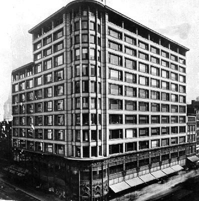
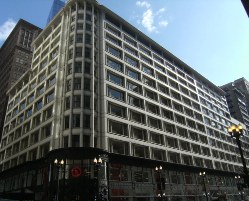
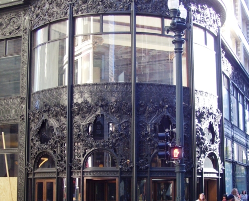
"Walking amidst the endless crowd of tall buildings in Chicago’s downtown neighborhoods, the twenty-first century viewer, overwhelmed by the colossal Hancock Tower (1970) almost misses the comparatively stocky, whole-block office buildings and stores in Chicago’s Loop that first gave rise to the term “skyscraper” in the late nineteenth century. At the intersection of State and Madison Streets, however, one building with large glass windows and a rounded corner entryway covered with lavish decoration stands out. In contrast to its relatively plain neighbors, the pedestrian’s eye is immediately attracted to the structure’s bronze-colored ground floor and broad white façade stretching twelve stories above it. This is Louis Sullivan’s Carson, Pirie, Scott building, a department store constructed in two stages in 1899 and 1903-04.
Sullivan’s building is an important example of early Chicago skyscraper architecture, and can also be seen as a fascinating indicator of the relationship between architecture and commerce. Sullivan illustrates this philosophy by describing an ideal tripartite skyscraper. First, there should be a base level with a ground floor for businesses that require easy public access, light, and open space, and a second story also publicly accessible by stairways. These floors should then be followed by an infinite number of stories for offices, designed to look all the same because they serve the same function. Finally, the building should be topped with an attic storey and distinct cornice line to mark its endpoint and set it apart from other buildings within the cityscape. For Sullivan, the characteristic feature of a skyscraper was that it was tall, and so the building’s design should serve that goal by emphasizing its upward momentum.
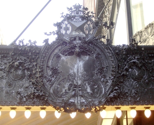
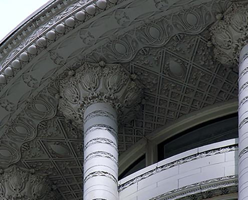
The corner entryway and the entire base section are differentiated from the spare upper stories by a unified system of extremely ornate decoration. The cast-iron ornament contains the same highly complicated, delicate, organic and floral motifs that had become hallmarks of Sullivan’s design aesthetic. For Sullivan, the decorative program served a functional project as well, to distinguish the building from those surrounding it, and to make the store attractive to potential customers.
The upper parts of the Carson, Pirie, Scott building also reflect Sullivan’s adaptation of his skyscraper theory to a department store. Each successive story of the white terra-cotta façade contains identical windows, in this case the three-sectioned “Chicago” window common to late nineteenth-century skyscrapers in the city. There is an overhanging cornice at the very top that seems to signify the end of the building’s ascent, and makes the slightly set-back attic level distinct from the broad mid-section and the dark cast-iron decoration of the base level.
Unlike Sullivan’s office buildings, however, the building’s primary thrust is horizontal rather than vertical. Sullivan’s design emphasizes the long, uninterrupted lines running under each window from each side of the building towards the entry bay, while the decorative base at the bottom and the cornice line at the top flow seamlessly around the corner. With its elaborate decorative program and attention paid to the functional requirements of retail architecture, Sullivan’s design was a remarkably successful display for the department store’s products, even if it diverged from the wholly vertical effect of his earlier skyscrapers.
"
Information provided in part by: Smarthistory.org

