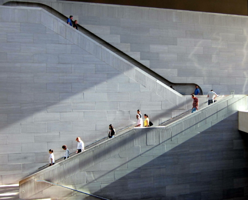
National Gallery of Art East Wing
I.M. Pei (Pei Cobb Freed & Partners) | Website | 1978 | Visitor Information
Constitution Ave NW, Washington D.C. 20565, United States of America
"
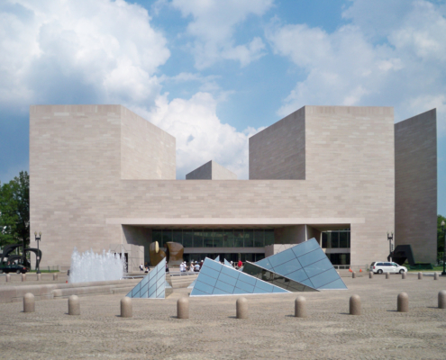
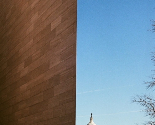
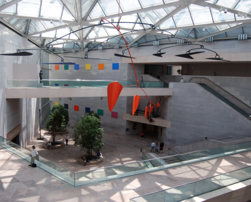
What would eventually become known as the West Building of the National Gallery of Art was financed by art collector Andrew Mellon. Architect John Russel Pope was hired to design the museum in the late 1930s, with the intentions of leaving space for future additions. Mellon's son Paul had the responsibility of choosing the architect for the expanse years later, so he turned to one of the most forward-thinking architects of the twentieth century, I.M. Pei. The two most prominent aspects of the project that made the design challenging for I.M. Pei were the buildings form and function, as the small trapezoidal plot that was reserved for the building created a difficult site on which to design. Pennsylvania Avenue which was at an angle to the north side created a strange limit, as did the proximity of the National Mall to the south. Furthermore, the building limits were also restricted because the adjacent land was marked as the President's inaugural route. But the most demanding part of the design was that it needed to fit in with the monumental scale of the Mall while also harmonizing with the already-built neoclassical design of the West Building. In attempts to work with the shape of the site, Pei implemented forms that reflected the trapezoidal form. When the plot was initially discussed with Pei, he explains that first he "sketched a diagonal line across the trapezoid and produced two triangles. That was the beginning." The first triangle, an isosceles, would contain the exhibition space, and the second, a right triangle, would accommodate administrative offices, a library, and a study center for art research. This isosceles triangle became a unifying motif of the building, found in the marble floors, steel frame, and glass skylights. These acute and obtuse angles are also repeated in the building's hexagonal elevators and trapezoid-shaped office desks. To visually unite the neoclassical style of the West Building, characterized by balance and symmetry, and the East Building which houses modern art, Pei constructed the exterior of his building with the same pink Tennessee marble used in the other building. Dust of this same marble was mixed with concrete to create the beautiful color of the interior walls. A second unifying factor is a powerful axial link where the East Building's main entryway is aligned along the West Building's east-west axis, opening up a plaza space between the buildings. This serves to establish a transition through elements like the marble paving stones and glass pyramids which reference the frame ceiling of the East Building. These glass pyramids have since become a trademark of museums designed by I.M. Pei. The interior opens up to a large atrium; the openness of the space invites visitors to gaze upwards and let their eyes travel around the building without feeling overwhelmed. Although Pei wanted to recreate the hard-edged lines of the exterior and triangular design, he realized that it would be best to soften these lines for a warm and inviting feeling. He designed large round planters to counteract these edges, each planter containing ficus trees which helped create a sense of scale in the large atrium.
"
Tags: Classic, Washington D.C.
Information provided in part by: Arch Daily

