After the completion of Centre Pompidou in 1977 with Renzo Piano, Richard Rogers was commissioned to design a new building to replace the original Lloyd’s insurance building in London.
It would be the second expansion in the history of the company’s headquarters due to the overcrowded conditions of hundreds of people working with international insurance cases. Completed in1986, the Lloyd’s building brought a high-tech architectural aesthetic to the medieval financial district of London that was previous implemented in the design of the Centre Pompidou in Paris.
Since 1928, the site has been home to the Lloyd’s of London; one of the largest insurance firms in the world dating back to the 17th Century. After it originated in the 17th Century, the Lloyd’s of London has grown from an insurance company dealing from within the United Kingdom to working on a global scale, taking on staff and clientele at an unprecedented rate, which has required several expansions; the largest and most prominent being Roger’s.
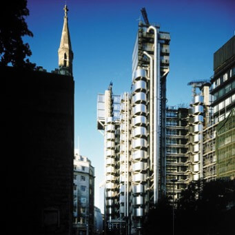
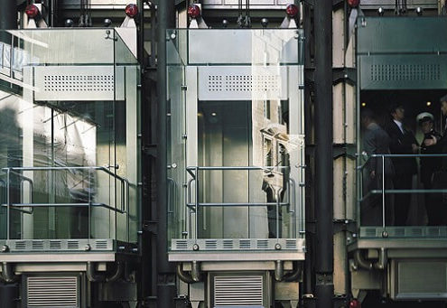
Similar to Centre Pompidou the Lloyd’s building is designed “inside out.” All of the service functions are removed from the interior and placed at the exterior of the building. This not only allows for easy replacement and maintenance on the elevators, plumbing, or electrical facilities, but it frees up the interior to create an open and flexible plan that allows for uninterrupted activity on each level.
With the open spatial planning, the interior is capable of being reconfigured on a moment to moment basis with partition walls that can subdivide each floor and create new and interesting spaces.
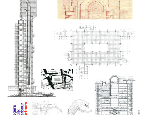
The Lloyd’s of London building consists of three main towers-each attached to their own service tower-that are concentrically oriented around a 60 meter atrium at the heart of the building. Each floor acts as a gallery overlooking the atrium; however, only the first four floors are open to the atrium whereas the rest are enclosed by glass panels.
Throughout the atrium, there are a series of escalators cutting across the void to create an interior circulation that links the floors of the underwriters adding to the dynamism of the space.
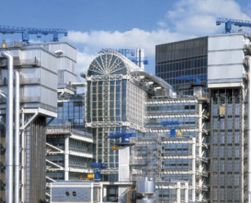
When Roger’s took on the project, it required the demolition of the original 1928 building, but rather than completely demolishing all traces of history for the Lloyd’s of London, he retained part of the original façade as an homage. The historic architecture of the past juxtaposed to the high-tech style of the new Lloyd’s building seems almost contradictory and forced, but the two styles seem to coexist in a manner depicting the modernization of London.
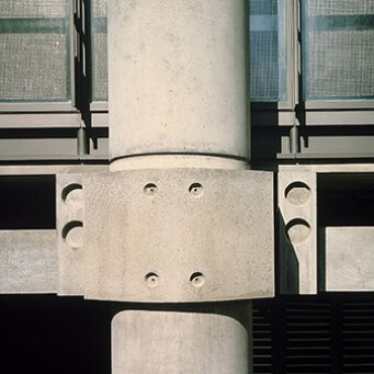
Besides the mechanical and circulatory systems being placed on the exterior, the façade of the Lloyd’s of London building is not contiguous in the sense that it appears to be a “kit of parts,” where interior spaces seem to be modular. Its seemingly compartmentalized façade reinforces its modularity in the plan, but is visually more apparent in the elevation.
The entire building is wrapped in stainless steel giving the building a high-tech, almost post modern, aesthetic. The streamlined façade juxtaposed to the mechanical and service functions on the exterior evoke the technological advances of its construction, as well as express the building’s main focus on functionality.
The aesthetic appears to have an almost unfinished quality to its construction; Roger’s even left the cranes from the construction on the top of the building as a decorative feature to the building, but their presence suggests insight into the modern aesthetic as well as creating a place for the Lloyd’s of London building within architectural modernism.
Information provided in part by: Richard Rogers

