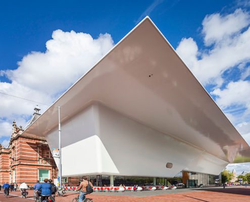
The Stedelijk Museum is internationally known and renowned for its commendable collection of contemporary art. Although her collection is equivalent with the international top museums in this field, the building was outdated. The position on the Museumplein (Museum square) in Amsterdam, where the Rijksmuseum, the Van Gogh Museum and the Concertgebouw also are situated, created all options to be back at the top of the museums with a renovated and expanded building.
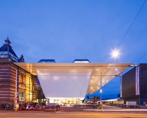
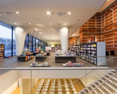
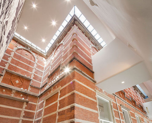
The existing building of the Stedelijk Museum created in 1895 by the municipal architect A.W. Weismann, is celebrated for its majestic staircase, grand rooms and natural lighting. These strong points have been retained in the design by Benthem Crouwel Architects along with the colour white, introduced throughout the museum by former museum director Willem Sandberg (1945-1962). The new extension does not ask for more of the same, but to supplement by variety and by adding new opportunities for exhibitions. The old remains and forms unity with the new. Both in terms of exhibitions and routing, making compelling choices between old and new has been averted. The expansion is not a subordinate, or very different pavilion next to the existing building, but an integrated addition. The contrast of the new building versus the old building is obvious from the outside; inside the museum you hardly notice strolling from the new building into the old.
The former entrance was unsuitable as a public entrance - with all the associated functions – to be maintained. While maintaining the strengths of the existing building was not possible to have all new components and public functions, which create a museum of the 21st century, in the existing building. This restriction had the obvious ability of turn the orientation of the new museum toward the Museumplein. The Stedelijk Museum is the first museum with an actual entrance on the Museumplein. To make sure that the available space at the Museumplein would not be overbuild, but instead was appropriated as an entrance plaza to the south, the rotated orientation is optimally exploited. The new entrance seamlessly fits into the existing central access zone of the symmetrical building and is an extension. By partly lifting the added volume and sinking the rest underground, the existing building remains virtually untouched and fully visible.
Information provided in part by: Benthem Crouwel Arhitects

