"
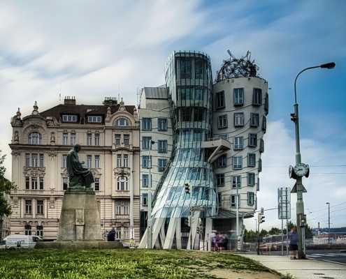
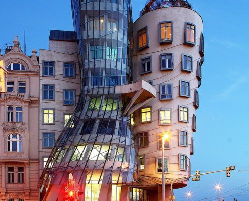
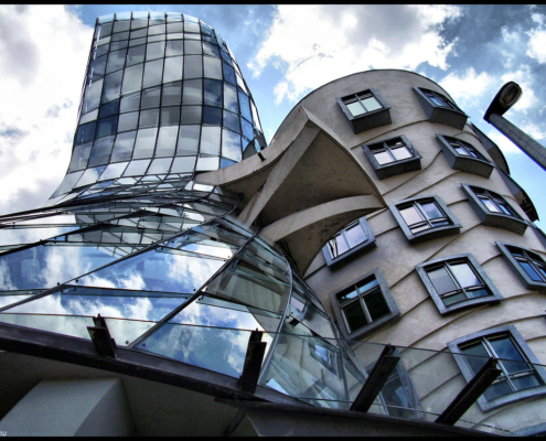
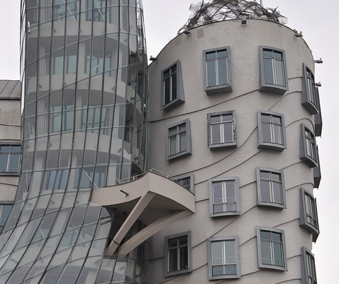
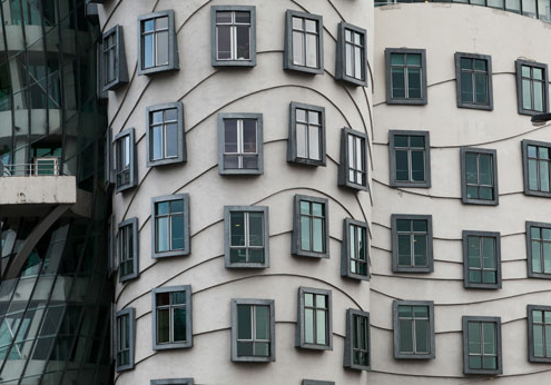
The Dancing House or Dancing Building or Ginger & Fred is the nickname given to the Nationale-Nederlanden building in downtown Prague, Czech Republic at Rašínovo Nábřeží 80, Praha 2. It was designed by Canadian-American architect Frank Gehry in co-operation with Croatian-Czech architect Vlado Milunić on a vacant riverfront plot. The building was designed in 1992 and completed in 1996. The very non-traditional design was controversial at the time. Czech president Václav Havel, who lived for decades next to the site, had supported it, hoping that the building would become a center of cultural activity. Originally named Fred and Ginger the house stands out among the Baroque, Gothic and Art Nouveau buildings for which Prague is famous. The “Dancing House” is set on a property of great historical significance. In its place a house was destroyed by a bomb during live World War II. The plot and structure lay decrepit until 1960 when the area was cleared. The neighboring plot was co-owned by Czech ex-president Vaclav Havel. Havel spent his childhood next door and eventually decided to have a survey taken of the site by future designer Vlado Milunic, hoping for it to be the site of a cultural center. ING Bank soon agreed to sponsor the building of a house on site. The “super bank” soon chose Milunic as the lead designer and asked him to partner with another world-renowned architect to approach the process. Jean Nouvel turned down the idea because of the minute square footage. Well known American architect Frank Gehry accepted the invitation. Because of the bank’s excellent financial state at the time, it was able to offer almost unlimited funding for the project. Known as deconstructivist architecture due to its unusual shape. The “dancing” shape is supported by 99 concrete panels, each a different shape and dimension. On the top of the building is a large twisted structure of metal nick named “Medusa”. “In the interior of a square of buildings in the eighteenth and nineteenth century, the Dancing House has two central bodies. The first is a tower of glass that is close to half height and is supported by curved pillars, the second runs parallel to the river, which is characterized by the moldings that follow a wavy motion and distributed through the windows so the non-aligned. This solution has been driven mainly by a kind of aesthetic consideration: the windows lined evidenciarían that the building has two windows, although they have the same height as the two adjacent buildings of the nineteenth century. They also don’t have to be perceived in the will of the designer, as simple forms on a flat surface, but must achieve the effect of three-dimensionality, hence the idea of frames as outgoing frames of paintings. Also the winding moldings on the facade make it more confusing perspective, diminishing the contrast with the buildings that surround it.”
"
Information provided in part by: ARThitecture

