"
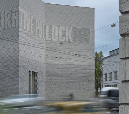
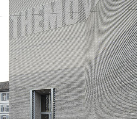
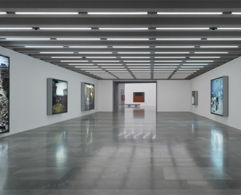
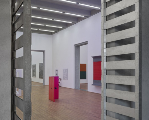
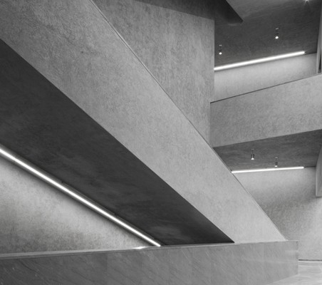
The new and enlarged museum consists of two buildings that together form a unified presence in the urban space. They are in direct communication with each other across the street that runs between them. The new building’s roof line is level with that of the existing structure, so it meets its counterpart on an equal footing; its entrance looks out toward the main building’s arcades, which conversely enjoy an excellent view of its striking façade. The new building’s distinctive inverted corner is a symbolic response to the old Kunstmuseum’s no less distinctive projecting corner. At the same time, the indented façade is a gesture of welcome, an invitation. It frames the intersection, effectively turning it into its own forecourt. Each floor of the new building has two exhibition tracts connected vertically by the monumental central staircase. Together with the foyer zones, the staircase describes a free and expressive figure in space illuminated from above by a large round skylight. By contrast, the gallery suites as such are structured by right angles. The rooms have a powerful physical presence. The elements that define them are clearly articulated components; assembled, they generate a tectonics that maximizes the architectural effect of the whole. The galleries feature an industrial parquet floor made of oak strips glued directly onto the screed and grouted with wood cement. The supporting wall made of concrete with gray rendering is similarly explicit, as is evident in the door and window reveals. In the foyer, the marble flooring and galvanized steel wall cladding come together in an aesthetic whole that is expressive of both difference and harmony at once. The unusual combination of two materials with radically different connotations generates the distinctive and unmistakable character of our building, in which contemporary technology is used to implement the timeless laws of architecture. The façades are gray brick walls that exude the timeless and archaic air of an ancient ruin. They were designed to be self-supporting and monolithic, and their emphatic horizontality, with elongated bricks that are just four centimeters high, heightens their presence. The striking pattern of shadows cast by the alternately projecting and receding layers of brick amplifies this impression. Like the main building’s façades, those of the new building hint at classical architecture’s standard tripartite order of base, middle, and capital. This order is visualized through the brickwork’s different shades of gray as well as a frieze executed as a delicate relief. Thus, while the new building does indeed speak the same language as its counterpart, the story it tells is a different and novel one. We understand it as neither a repetition nor a copy of the main building, but rather as an emphatically contemporary, forward-looking building capable of accommodating completely new forms of art and the engagement with it.
"
Tags: Recent, switzerland
Information provided in part by: Arch Daily

