The New Museum
"
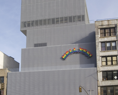
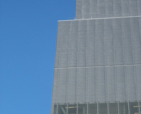
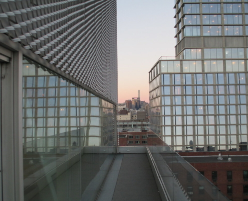
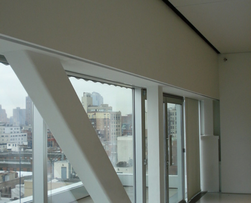
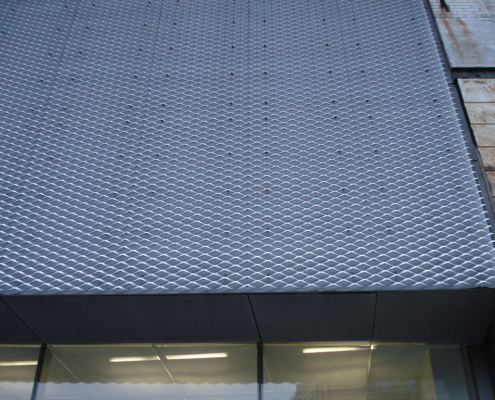
The New Museum is the product of a daring vision to establish a radical, politicized center for contemporary art in New York City. With the aim of distinguishing itself from the city’s existing art institutions through a focus on emerging artists, the museum’s name embodies its pioneering spirit. The resulting structure, a stack of rectilinear boxes which tower over the Bowery, would be the first and, thus far, the only purpose-built contemporary art museum in New York City. SANAA’s design for the New Museum comprises seven boxes of varying proportions, vertically stacked around a central core. The architects avoided using the maximum square footage permitted by the zoning envelope, affording themselves the space to shift these boxes off-center and create a dynamic interplay between the volumes. The unique plan of the building was intended to create a distinct architectural identity that would reflect the experimental philosophy of the clients. The programmatic elements of the museum are spread across its ten stories; housed within the boxes are galleries, offices, events spaces, a café, a theater, an education center, and two mechanical floors. One of SANAA’s primary goals for the project was to create an approachable and inviting museum. In order to achieve this, they installed a glass wall at street level to physically instill a sense of openness and transparency. The boundary between the street and the museum is dissolved by this membrane, encouraging passers-by to enter. The continuation of the concrete sidewalk to the concrete floor of the museum further adds to this effect. The glass panels of the wall are sunk into the floor and extend into the ceiling, thereby masking their frames and avoiding any sense of division which might be created by these borders. The art loading bay is exposed by the glass wall, revealing the back-of-house activity of the museum and implying transparency on the part of the institution itself. The interior also features glass walls, such as that which separates the gallery at the back of the first floor from the lobby and café at the front. Thus, the reach of the museum extends beyond the building, with the art on display visible even to those on the street. The use of glass walls was facilitated by the structure of the building, which relies on steel trusses to bear the load of the boxes. The trusses also allow the galleries to exist column-free, providing an unobstructed and highly adaptable exhibition space. In certain places, the trusses are exposed to become decorative features, with diagonal struts bisecting the windows. The galleries are almost devoid of windows; wall space was prioritized over fenestration. The shifting of the building’s component boxes was a solution devised to allow natural light into the galleries through skylights in the resulting protrusions. At night, the artificial light produced inside the galleries spills out through the skylights, diffused by the scrim coverings and softly up-lighting the building. The ceiling structure of the galleries was left exposed to allow art to be hung from above, again providing greater and more flexible exhibition space. The exterior is clad in two layers of industrial aluminum mesh, creating a shimmering, textured façade. Though steel mesh is more commonly used in construction, aluminum was chosen as a brighter and more translucent material which would lend a sense of lightness. The mesh softens the edges of the building, allowing it to melt into its surroundings and adding to its transparency. The New Museum, both in terms of the building and the institution it houses, stands as a symbol of the transformative power that both art and architecture can have upon society.
"
Tags: new york city, Recent
Information provided in part by: Arch Daily

